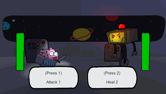
After creating some new enemies yesterday, naturally, today I upgraded the UI instead! The last part of the UI that needed to be changed was the text sitting in the top-right corner. It didn’t fit the rest of the style, it would cover some other UI elements, and the health values were redundant with the health bars that have been in the game for a bit already.
To fix that up, I opted to switch over to some cute, small icons. The icons are a lot easier to parse quickly, stack up next to each other well, and fit the game a lot better than what was there before! Again, a fairly easy and simple change, but I think it adds a lot of charm that the text never could while still keeping things easy to follow.
See you tomorrow,
-Robert